Reading a World Cup Final Through Passing Data
Reading a World Cup Final through passing data — and what data viz can (and can’t) do.
I used StatsBomb’s open event data for the 2022 World Cup Final (Argentina 3–3 France) to build eight passing visualisations, trying to answer one question:
How much of a team’s “style of play” can you actually recover from the passing data of a single match?
Why Passing Data, and Why Is It So Hard to Draw?
Nobody disagrees that passing data matters. A pass is the most frequent event in football — this final alone produced 1,263 of them — and every pass carries a start point, an end point, a height, a length, a direction, and an outcome. That richness is exactly the problem. The moment you draw a chart, the questions multiply: length, height, or direction? Start-point density or the spatial distribution of average length? What goes on the colour axis — frequency, length, forwardness? What does opacity mean?
There is no canonical answer. Every figure is one projection of the same event stream, and a different projection tells a different story. A heatmap of pass origins says “where did they have the ball”; the same cells coloured by mean pass length says “what did they do with it from there”; colour them by forwardness and you get intent. Same data, three different matches on the page.
The longer I do this, the more I believe a visualisation’s real value is not to replace an expert watching the tape, but to take the judgment they build after hours of re-watching and surface it as quickly and intuitively as possible — giving subjective expertise an objective substrate that can be shared, debated, and falsified.
A good chart isn’t an answer. It’s evidence.
The Figures
All plots use StatsBomb open event data, rendered with Python, matplotlib and mplsoccer. Both teams attack left → right; each pitch shows passes by one team, smoothed with a Gaussian kernel (σ ≈ 1.8 m) so the colour reads as a local average rather than individual dots.
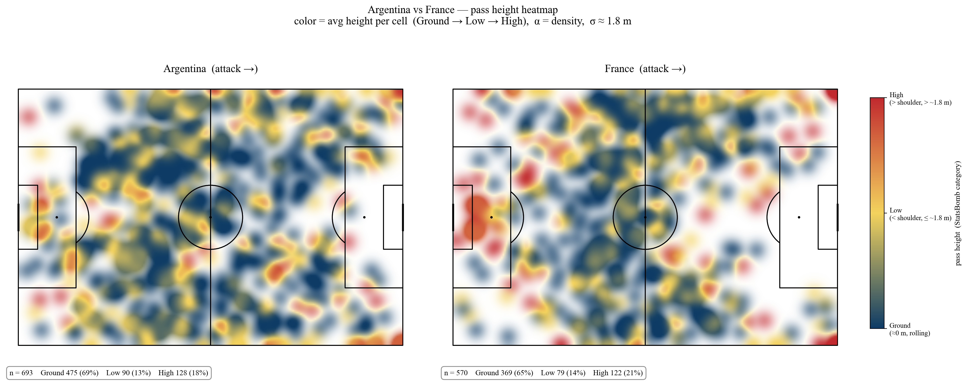
Pass height. Colour is the average StatsBomb height category per cell (ground → low → high), opacity is local pass density.
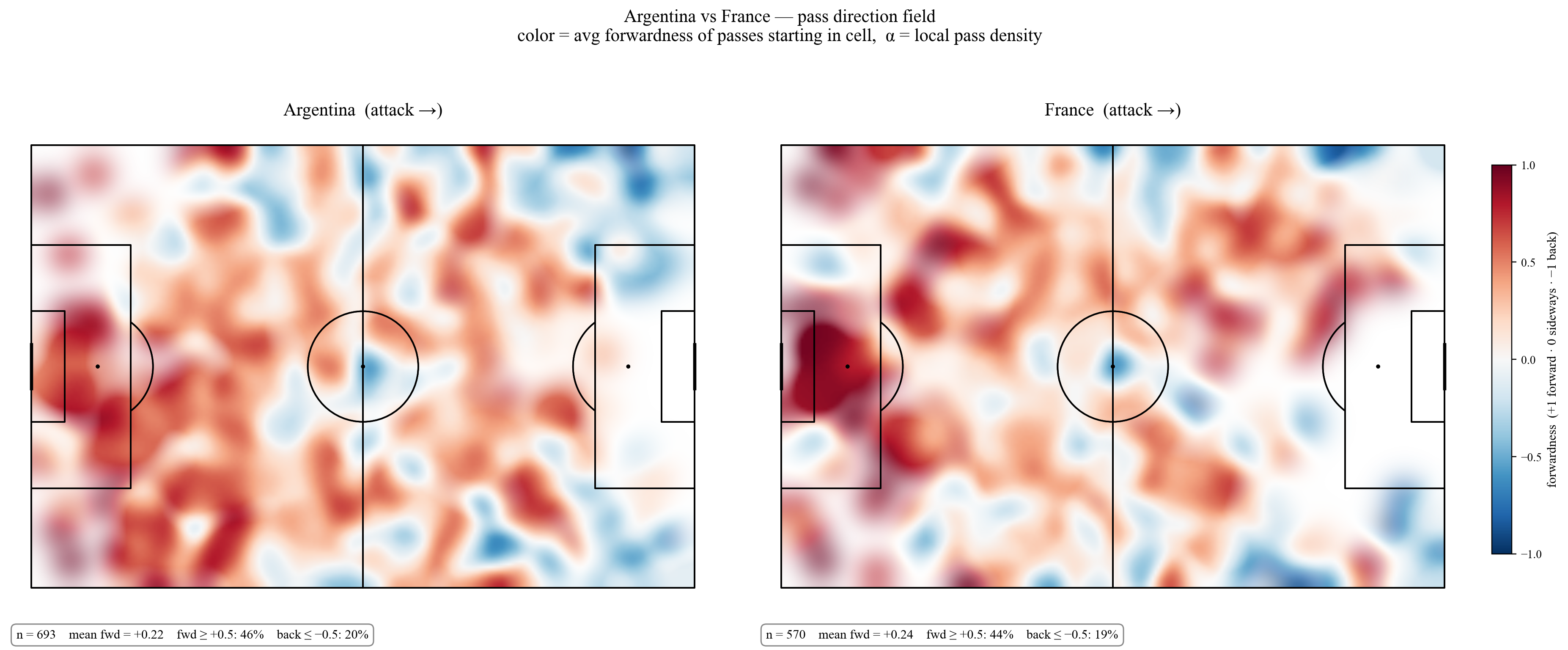
Pass direction. Colour is the average forwardness of passes starting in each cell: +1 fully forward, 0 sideways, −1 backward.
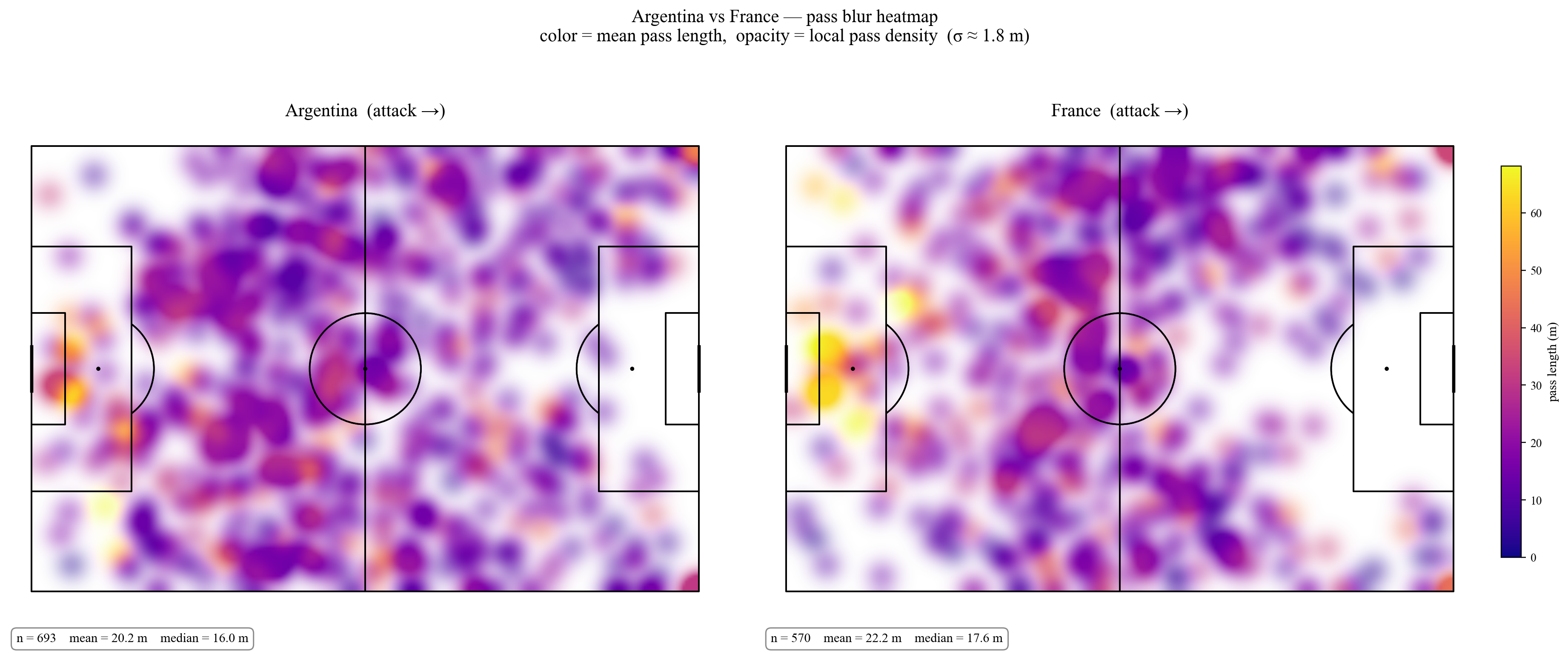
Pass length. Colour is mean pass length per cell, opacity again is density — so a bright yellow blob means “from here, they hit it long, often.”
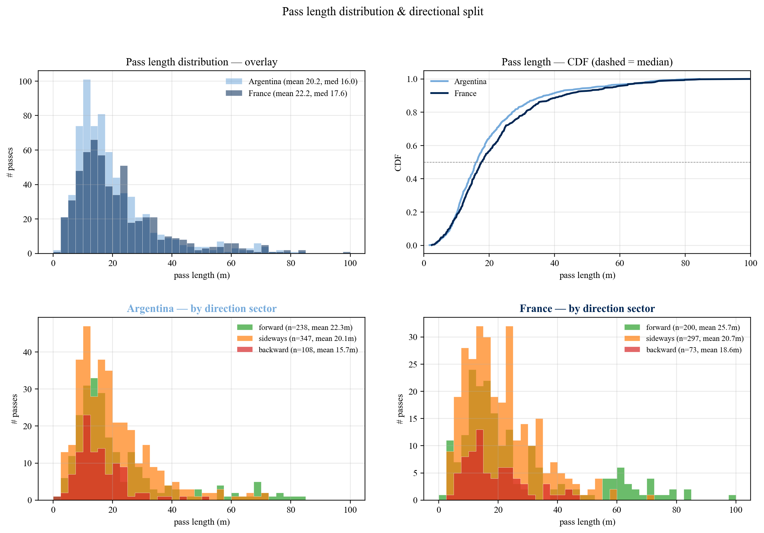
Distributions. Overlaid pass-length histograms and CDFs, plus each team’s length distribution split by direction sector (forward / sideways / backward).
So what did these figures say about this final?
1. Argentina Played the “Possession” Version of a Final
693 passes vs France’s 570. Mean length 20.2 m (France 22.2). 69% on the ground. Pass-start density bright across midfield and the attacking third (164 attacking-third passes). On the forwardness field, “forward” hotspots are scattered everywhere — patient build-up that can launch from anywhere.
That last point is the one I would not have guessed from memory. The popular recollection of this final is Messi-centric: moments, not structure. The data says the structure was there all along — Argentina sustained possession deep into France’s half, recycled it short, and progressed from many different zones rather than through one designated outlet. The shape of the histograms backs this up: Argentina’s distribution piles up at 10–20 m, and their backward passes are the shortest in the match (mean 15.7 m) — quick resets to keep the machine turning, not panicked clearances.
2. France Played the “Transition” Version of a Final
41% of France’s defensive-third passes were ≥ 25 m long balls (Argentina: 31%). High-pass share 21% vs 18%, clustered on the left of their own half — Upamecano and Varane spraying forward. The mean length of France’s forward-direction passes was 25.7 m, three metres longer than Argentina’s. And only 100 attacking-third passes — almost the entire attack relied on a handful of direct, vertical transitions.
You can see it in one glance at the pass-length heatmap: the brightest yellow on France’s pitch sits squarely around their own penalty area and left channel. The launch zone. Argentina’s equivalent area is dimmer and more purple — shorter, calmer exits. France’s by-direction histogram makes the same point a different way: their forward passes have a visible second bump out at 55–70 m that Argentina’s simply doesn’t have. Those are the balls hunting Mbappé’s shoulder run.
3. The Forwardness Field Tells the Subtlest Story
Both teams have nearly identical mean forwardness (+0.22 vs +0.24). If you only read the summary statistic, you’d call them equally “direct” and move on. But the spatial distribution is opposite: Argentina’s forward-red is scattered all over the pitch; France’s is compressed into the defensive flanks plus right midfield. Tchouaméni and the centre-backs were the launch pad.
This is exactly the kind of finding that justifies drawing a map instead of quoting a mean. Two identical averages, two completely different footballing ideas underneath. It’s also a small warning about single-number team metrics in general: directness, verticality, tempo — every one of them is a spatial pattern flattened into a scalar, and the flattening is where the style gets lost.
What the 3–3 Actually Means
Argentina tried to grind it out through possession. France tried to steal it through Mbappé’s speed in transition. One patient, one vertical. 3–3 plus penalties is the cleanest evidence that neither philosophy could suppress the other.
The usual caveats apply, and they matter. This is one match — the highest-variance, highest-stakes match there is — and a final is a terrible sample of a team’s “true” style. France spent long stretches chasing the game, which mechanically inflates directness; Argentina spent long stretches protecting a lead, which inflates possession share. Event data also can’t see the off-ball: the press that forced a long ball doesn’t appear in the passing table, only its consequence does. A one-game read is a hypothesis, not a verdict.
But within those limits, the answer to my opening question is: more than I expected. Eight projections of a single match’s passing recovered, without any tactical annotation, the same characterisation a scout would give you — Argentina’s distributed patience, France’s compressed verticality, the centre-back launch pad, the Mbappé outlet. The data didn’t discover anything the experts didn’t know. It made what they know visible, fast, and checkable — which is the whole job.
A good visualisation isn’t there to make analysts look sophisticated. It’s there to turn a pattern only a few experts can see on tape into something almost anyone can grasp in 30 seconds. Data is cold; good figures amplify the warm, intuitive things experts already feel.
Data: StatsBomb open-data · Stack: Python + matplotlib + mplsoccer